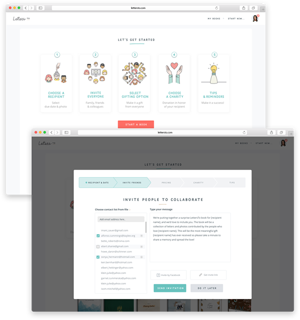
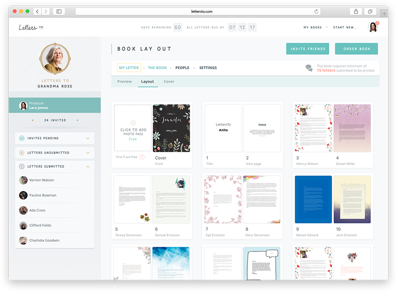
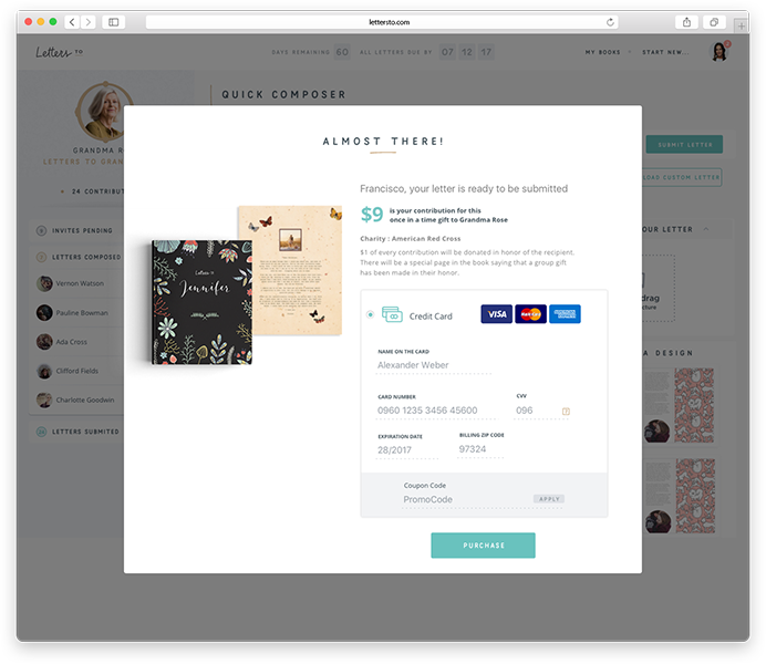
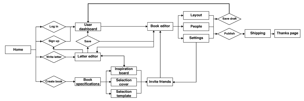
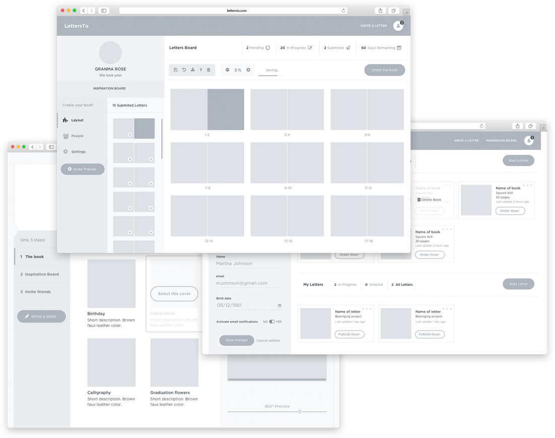
LettersTo

Main product of the startup Dreamable in San Francisco, California. It consists of a digital platform that allows users to create a collaborative book of letters and pictures. The book will get printed in a beautiful high quality sewn book and delivered once is finished. As the Lead Designer on this project I was responsible for the design and direction of the whole product from the beginning of the Startup in 2016, including digital and physical designs. Plus, I participated in the decision making along the whole project and collaborated on the conceptualization of it.

get started

This project had such a unique product that there is nothing like it in the market. For that reason we needed to visually explain the process of doing a book very clearly in order to guide the user in a friendly and delightful way. It was challenging to make the user feel like they were having fun and not working, but we successfully created an identity and user experience that was simple and easy.

The book process

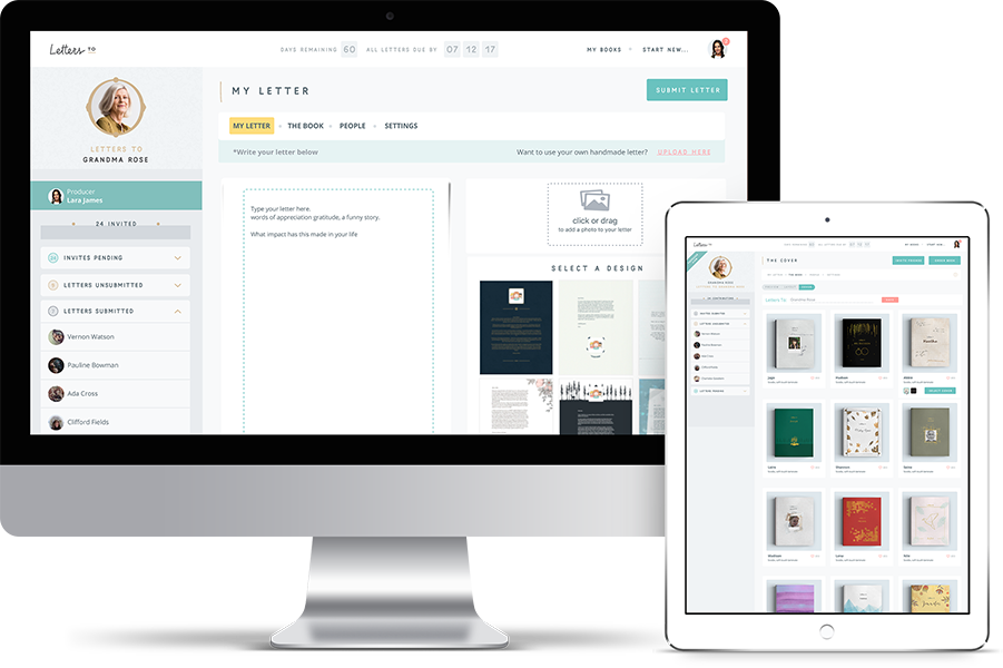
In the process of creating the book there are three main roles: The producer who will organize and decide the inside and outside look of the book, the recipient who will receive the book once is printed, and the collaborators who will have a page of the book to express both visually (photos and templates options) and literally (writing text) their message to the recipient. Encompassing the three of them as targets for our platform was a big challenge, considering that anyone could be a collaborator from a child to a senior.

Checkout

As a collaborative product each contributor pays a small amount. This system was inspired by the crowdfunding methods, which allows achieving a high quality physical product in a very economical way. With the micro payment the contributor collaborates, not only for the written letter, but also for the whole finishing of the book.

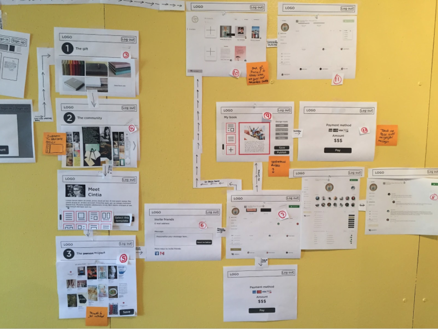
Conceptualization & UX methods

In the early steps of the project we worked deep in the psychology of the product through different methods of design such as card sorting, personas analysis and workshops with our target as participants. These exercises helped us understand the needs and challenges of our product and defined the essential aspects of the user experience.

UX Design

Based on the mentioned methods, we created a user workflow and Low-fi wireframes in the office wall. This helped define the main product, building our information architecture, understanding our needs, synthesizing new ideas and communicating them visually.

User workflow map

Hi-fi wireframes

Style guidelines

The product main aim was to invite people to express themselves in our website through both narrative and visual elements for a special person or event. The brand pillars where Delightful, Authentic, Collaborative and Keepsake. We wanted to communicate joy, celebration, something friendly and emotional. At the same time we were premium, unique and sophisticated. We found a balance by creating a very young, warm and friendly branding and applying it in a minimalist way to both our website and books.

typography

Mila Script
Mila Script bold
Open Sans
Open Sans Bold

color palette

#C6A479

#B4DDD3

#FF9E97

#FFDD7E

Icons

Related projects
  • Candu

    Product design for SAAS product
  • Garden care app

    App UX/UI, concept & branding
  • Trip App

    App UX/UI design, concept & branding
  • Pinball

    Videogame UI design, concept & branding
  • Work with me

    If you like this project and want to collaborate with me, please send an email to this address:

    hello@detorresdigital.com